Medical Guardian: Set-Up Assistance
The Challenge
As we age our chance of having a fall that results in an injury increases, so much so that each year 3 million seniors are treated in emergency departments for fall related injuries. Medical Guardian was founded to help with this problem, offering Medical Life Alert Systems which alert emergency services and emergency contacts when one of their customer’s needs help in an emergency such as falling.
Medical Guardian came to my team knowing they offered a wide range of products to help people at risk of falls, but found that some users were reluctant to activate their devices. Our goal was to figure out why and design a solution to increase user activation of their devices.
Project Overview
Role: UX Designer & Research Lead
Team: Angel Abun, Elisabeth McNeill, and Tanaira Morgan
Timeline: 2 Week Sprint
Tools: Figma, Figjam, Google Sheets, Google Docs
Methodology: Competitive Analysis, Secondary Research, Survey & User Interviews, Affinity Mapping, UX Storyboarding, Journey Mapping, User Flow, and Prototype Usability Testing
Understanding Why
What is a Life Alert System?
With no previous experience using life alert systems I needed to develop an understanding of what these systems do and who they help.
Medical Guardian offers 5 devices, for either at home or on the go use, that keep the user of the product connected to an emergency call service. In the case of an emergency the user can contact this service, and in some cases the device will contact the service automatically when a fall occurs.
I wanted to see how Medical Guardian’s products stacked up to their competition so I developed a competitive analysis on feature sets. From this analysis I saw that their products offer comparable features to the competition. Since it looked like they offered products that stacked up, I wanted to next learn from user’s to get their perspectives.
Reading Reviews to Get a Pulse Check
I wanted to get a pulse on what user’s were already saying before I jumped into surveying and interviewing, so my team and read through online reviews. It was important to do this before interviewing to help me structure the questions I would ask in interviews. From the reviews we saw that user’s were frustrated they could not always get through to a customer service representative during set-up.
The team also called customer service representatives at Medical Guardian and a few competitive companies to see what that experience was like and we learned that if a user orders through the phone, they do not get a tracking number so they do not know when the device will arrive at their home unless they call customer service back for an update.
“I wouldn't recommend any Medical Guardian system as it is impossible to get ahold of anyone or even a manager, I was told a manager would call me five days in a row and then zip. The activation code inside on back and the one on box weren't the same.”
-Online review
Talking to Users
This initial research taught us to focus on the customer service experience for our interviews. Since the reviews could not give us the full picture on why user’s were buying the device in the first place, we also chose to learn about that in our interviews. We interviewed 5 users: people who own a medical alert device or people who care for someone with a device. Using my interview guide to structure our interviews I learned:
how our interviewees felt about the device before purchase
why they purchased their’s
how they bought and activated their device
Three Patterns Emerged from Users:
-
Customers are Reactive
Users generally agreed to purchase their device after a health scare
-
Peace of Mind
They wanted to give their family and themselves peace of mind since they are home alone and have health risks, like increase chance of falling
-
Needing Assistance
Only 1 device owner set-up their device solo, and one caretaker said it was easy for him but his mom couldn’t have completed the set-up on her own
“We have all of this wonderful technology, but if it is not accessible to those who need it the most, and the people who would benefit from it, then what’s the point?”
— Caretaker
We realized we needed to focus our design on the owner’s of the device over the caretakers to increase activation and use, because not all device owners have the luxury of having people nearby who can help them with set-up.
Defining the Problem
Meet Gloria!
From my survey and interviews I was able to understand who the Medical Guardian user was, which led me to the development of Gloria to keep the user in mind throughout my design process.
Gloria’s Problem
After getting to know the user I realized that Gloria needs an understandable and efficient set-up process for her medical life alert system so that she is empowered to successfully utilize her device.
I started to ask myself how might we provide multiple avenues of assistance to guide Gloria during the set-up process? How might we create an efficient set-up process for Gloria to reduce frustration? And how might we create a help-platform that is senior friendly and easy to navigate?
Ideating and Creating
Imagining Gloria’s Experience
With these questions in mind, I started to brainstorm ideas with my team. I looked at Gloria’s journey, and sketched out a UX Storyboard to visualize what Gloria could do once she started to hit pain points along the set up.
Walking Through a New Set-Up Assistance Experience
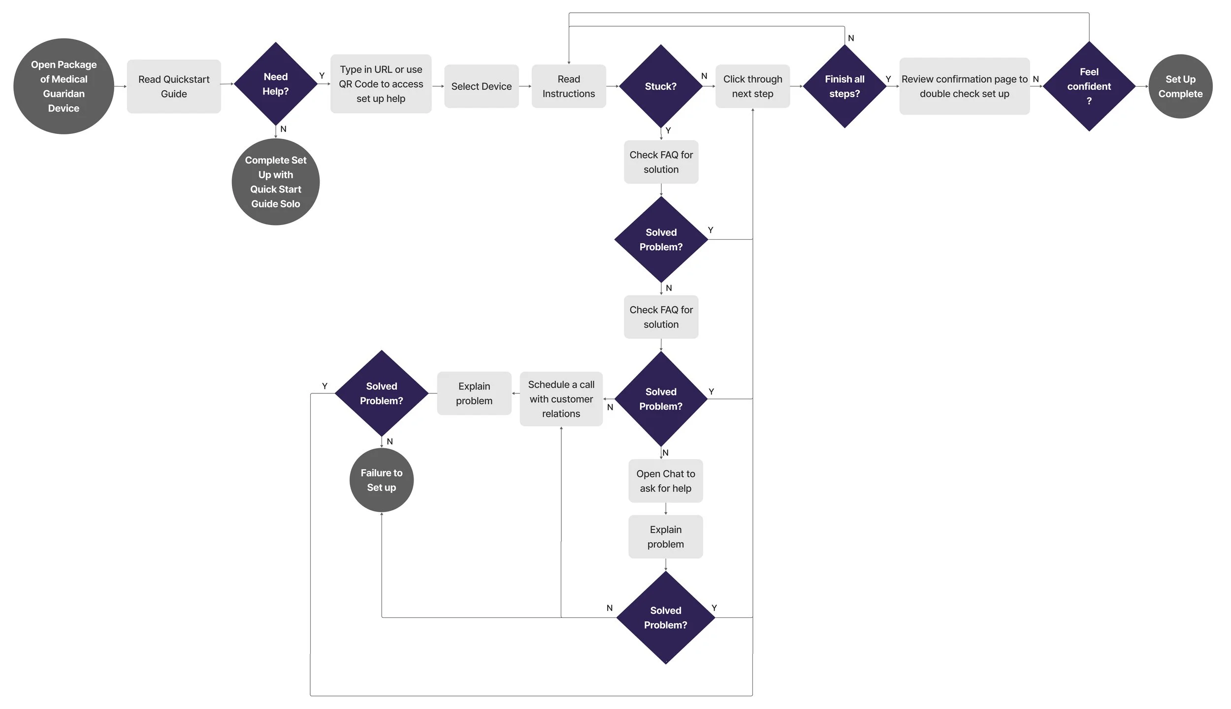
The Storyboard, in combination with a user flow which diagrammed how Gloria might navigate through our webpage helped us identify what she might access and in what order to inform page layout.
Using Insights to Design
Before the team and I sketched concepts, I did additional research on accessibility for seniors to uncover what we needed to know to design a website that will be helpful for Gloria. We knew we needed to make the website as easy as possible to make sure it was not intimidating for Gloria.
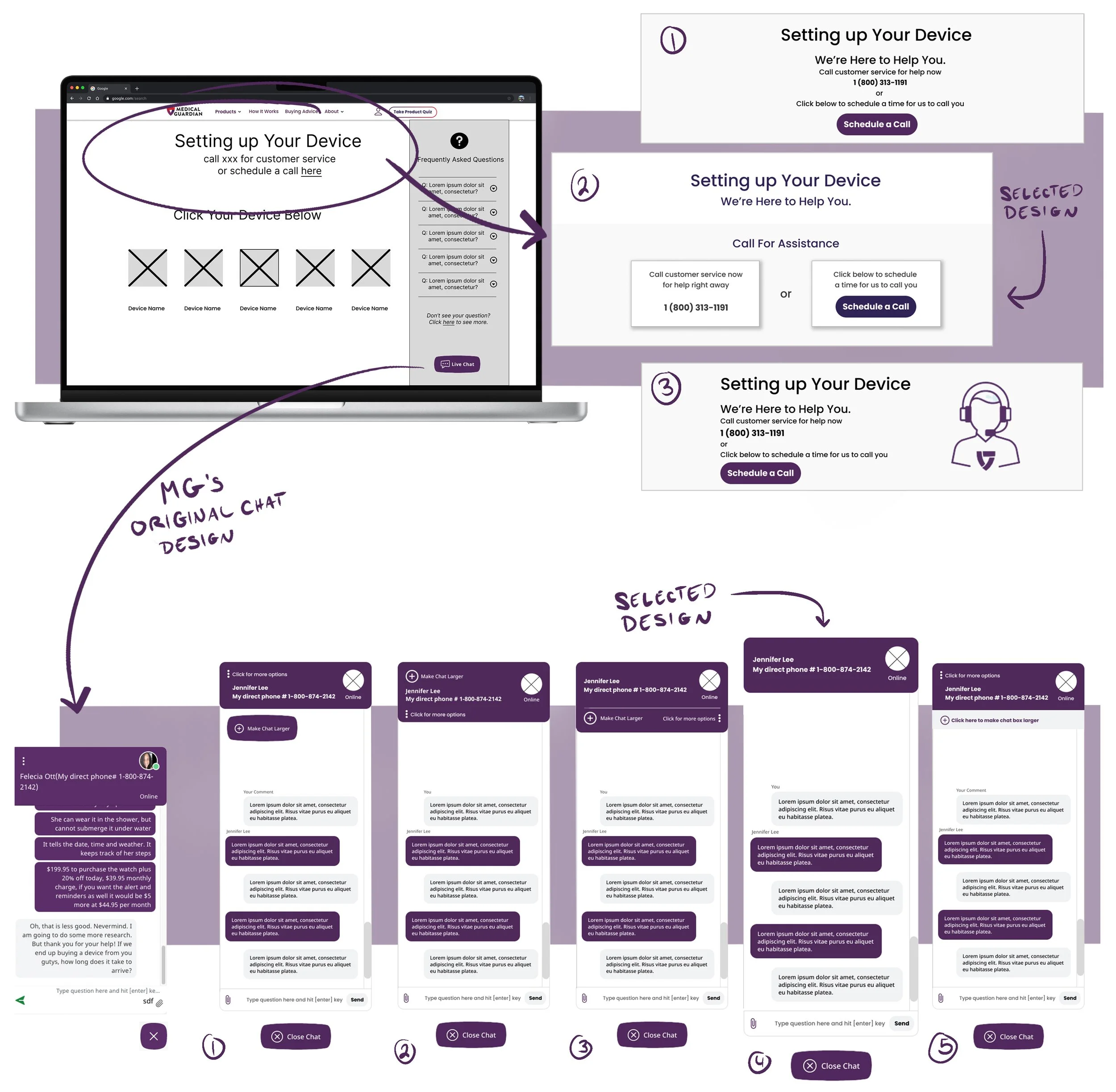
After the team did a group brainstorm sketching different screen layouts, we then broke up sections of the design to further iterate on and wireframe in Figma. I worked on the call assistance and chat features. From my call assistance concepts, the second concept was selected for its clarity in what options Gloria would have to choose from from an initial first glance. Since in our research we saw that user’s were on hold or had a hard time getting through to customer service I designed the “Schedule a Call” button to be the option that would jump out to Gloria first.
For the chat feature I modified the existing chat box Medical guardian uses to help add clarity for Gloria.
-
Call to Action Clarity
I changed the paper airplane icon to a send button and changed the close chat button to include text because in my accessibility research I learned clarity is key, don’t assume non-tech savvy user’s know what buttons mean, make the call to action really clear.
-
Reconfigured Chat Bubbles
I changed the chat button coloring to have the answers written by Jennifer Lee, her customer service assistant, jump out in their brand purple. I also added Jennifer Lee’s name above her first response so Gloria could be sure she knew who wrote what in the chat.
-
Who's on the Other End
I reorganized the top portion of the chat so Gloria could clearly read Jennifer Lee’s phone number if she wanted to call her, and relocated the “online” call out to be right under Jennifer Lee’s picture so Gloria could easily understand what online referred to.
Bringing the Elements Together
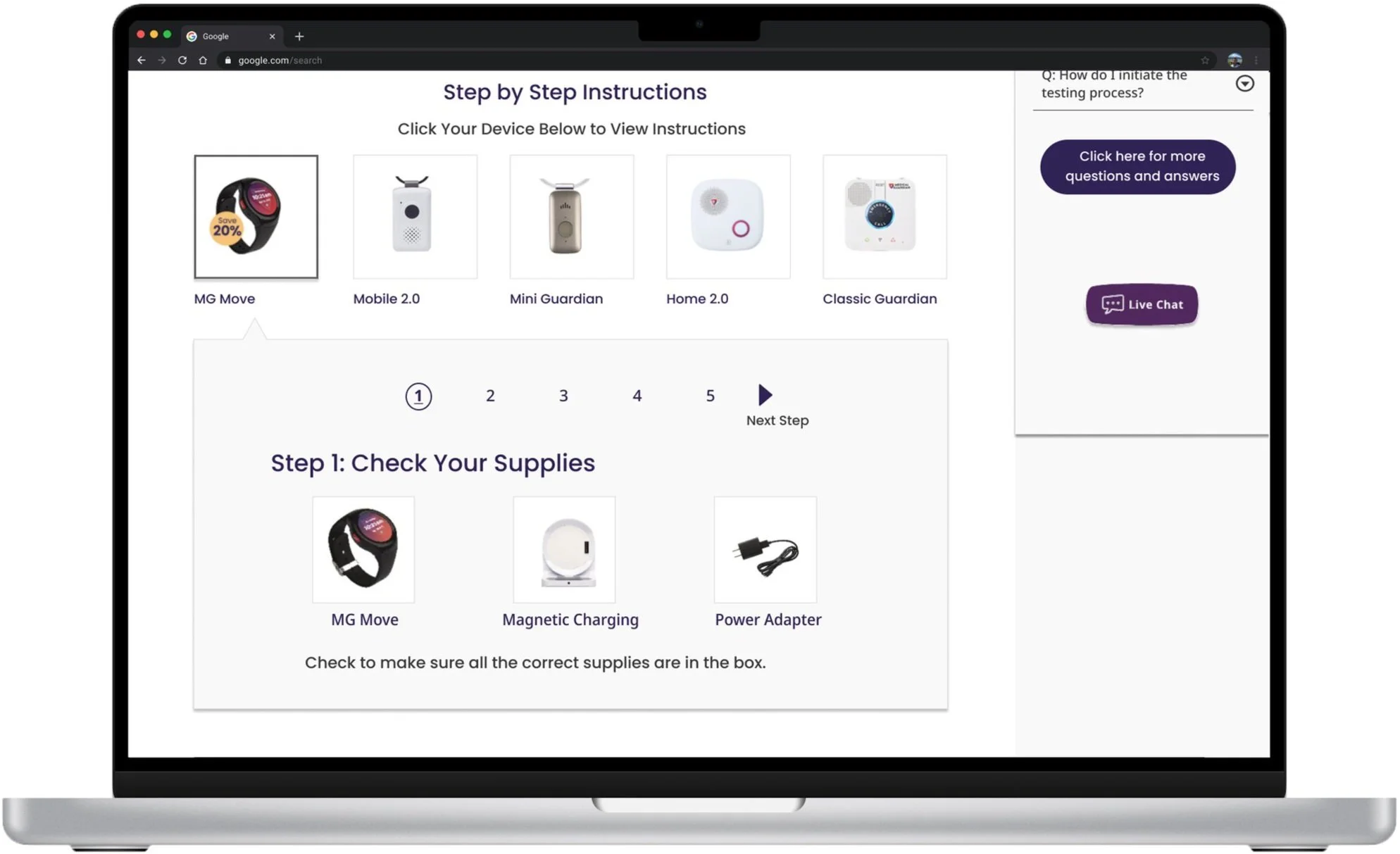
The prototype started to take shape as the team brought together our wireframes to form our prototype.
The Design in Action
Test
Did the Design Move the Needle?
I ran one of two usability tests on the prototype. I asked a previous interviewee and medical alert system owner to complete two tasks: navigate through the 1st and 2nd set-up steps, and set up a time for customer service to call him for additional help.
-
Successes
Both participants were able to find the set-up instructions and navigate to step 2
Both were able to schedule an appointment for a follow up call
Chat feature was used when participant wanted to get help
-
Pain Points
Users did not see the set-up instructions drop down immediately
There was a request for the font to be bigger
The chat feature blended in
-
Additional Takeways
FAQ is used as a last resort
Thought there was a lot of information on one page
Next Steps & Reflection
Since we were only able to test the design on 2 users, I want to test it more with our target demographic to better understand what pain points to improve. I would like to build in more accessibility features like the ability to zoom in or magnify the page, and accessibility settings which would give the user the ability to make font sizing bigger, and add more contrast to assist users with a wider range of vision loss. I would also like to run more research to see if people like Gloria would like a video call feature to help set up their device. I found in comparative research that some brands offer video call assistance for complex set up processes, but that feature was not included as part of our minimal viable product.
One big takeaway from this project was the importance of a clear project plan and roles. For the research section I developed a clear plan and deadlines, but for other sections of the project there was less clarity, which lead to some confusion across team members. As a team we had a retrospective on how the project went and we all agreed that on future projects we would want to help set ourselves up for success by adding in that clairity early on.


