Olives & Grace: E-Commerce Navigation
The Challenge
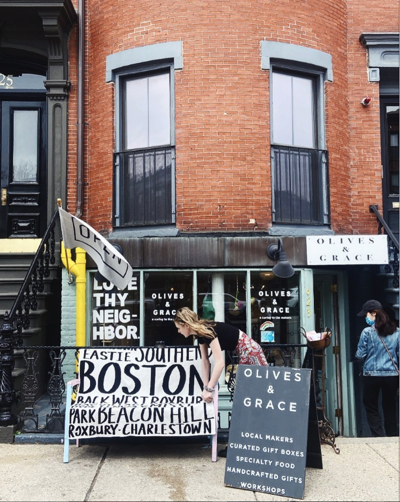
Olives & Grace is a local gift boutique nestled in the South End of Boston carefully curated with products made by emerging food and gift makers. They are a staple in their neighborhood and they take pride in creating a space that takes shoppers back to the days of walking into a local shop and engaging with their community.
Although their brick and mortar store is adored by local shoppers, they discovered a problem with their website. The owner noticed that people come onto her site, but very few of those visits convert to sales. From this I knew I needed to learn what drives people to shop locally and why they were not following through to purchase on her website.
Project Overview
Role: UX Designer
Timeline: 2 Week Sprint
Tools: Figma, Optimal Workshop, Google Sheets, Google Docs
Methodology: Competitive & Comparative Analysis, Heuristic Evaluation, Survey & User Interviews, Affinity Mapping, User Flow, and Prototype Usability Testing
Diving into Research
The Competitive Landscape
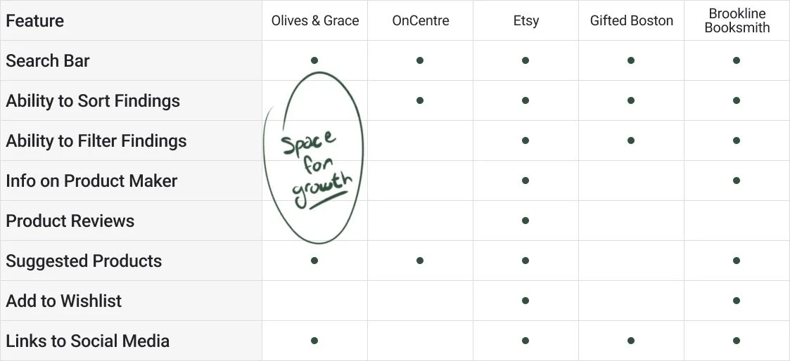
To get a better understanding of where this problem may be arising, I looked at comparators and competitors of Olives & Grace. From this I was able to see a distinct gap: filtering and sorting product listings. I also identified an opportunity to highlight the makers of the products sold at Olives & Grace.
What are the Pain Points?
I wanted to understand what was working and what pain points users may be running into while navigating the site so I ran a heuristic evaluation. From this I saw that a hidden search bar, the lack categorization of their product listing, misleading links, and no way to sort or filter products made it challenging for shoppers to find specific items.
Who Shops at Olives & Grace?
I wanted to dig deeper into what makes a person choose to shop locally and what they do when they are gift shopping. I interviewed six people who value shopping locally and discovered 5 major takeaways:
-
Uniqueness
87% of “local shoppers” value unique offerings while shopping
“You know how in TikTok you can see the owner, see who is behind the brand. Seeing her pour the candle one by one is unique.”
-
Ethics
4/6 interviewees spoke about the ethical decisions behind their shopping
“I start on Insta, then go to the about page to make sure they are a real company, that is a really big key. I want to make sure they are an actual thing and not web hosted in Yugoslavia.”
-
Discoverability
4/6 interviewees shop for gifts not knowing specifically what they will purchase
“For very few people I know what I am going to get and I get them X, that is not my standard shopping experience.”
-
Data
Shoppers need data, they want influencers, reviews, and a well rounded product description to help them decide
“A trusted recommendation goes a long way for me when I can’t shop in person.”
-
Connection
Shoppers want a sense of connection to something when they are shopping and buying products
“People don't just want to shop for stuff they want to shop for an idea, some sort of community.”
Defining the Problem
Meet Heather!
From my interviews I was able to understand who was the Olive’s and Grace Shopper, which led me to the development of Heather to keep the user in mind throughout my design process.
Heather’s Two Distinct Problems
She needs a way to discover unique gifts because she doesn’t always know specifically what to purchase but she wants to give a gift that will delight the gift receiver.
She also needs to know she is shopping at a place that legitimately supports “real people”, because she wants to know she is positively impacting the world she live in.
With Heather in mind I started to ask myself how might I highlight how unique the shop’s products are? How might I guide Heather to gift ideas when she does not have a specific gift in mind? How might I create an online shopping space that feels like a local shop and highlights Olives & Grace’s passion for supporting makers?
Ideating and Creating
Creating Order
Using a card sort to break down the products into category names Heather would understand, I developed a new site map so Heather didn’t have to endlessly scroll through the whole product catalog while shopping.
-
Old Site Map

-
Proposed Site Map

Forging a New Path
The redesigned site map helped inform my development of a new user flow, which created a path for Heather to find gifts faster and make her purchase.
Using Insights to Design
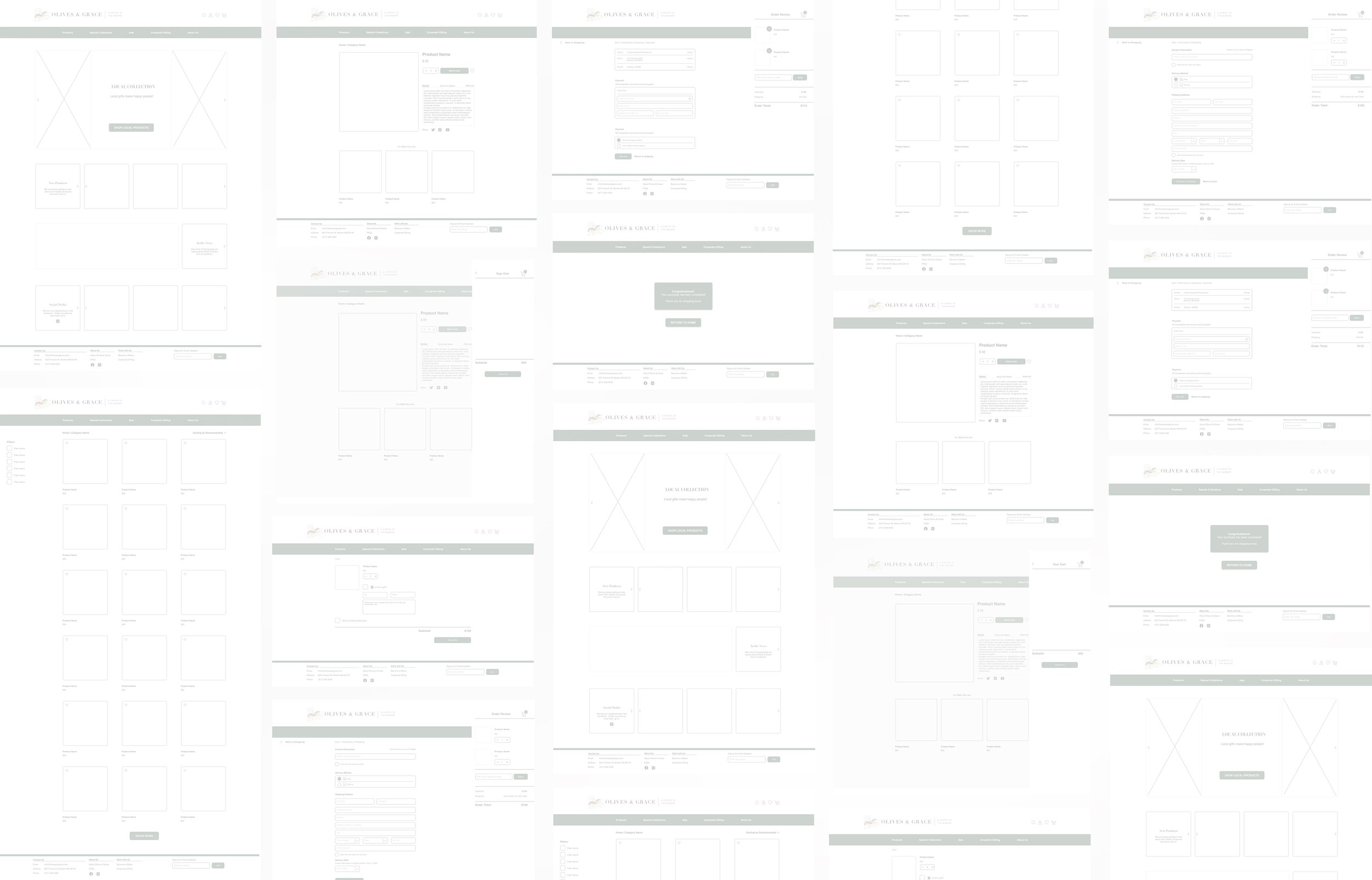
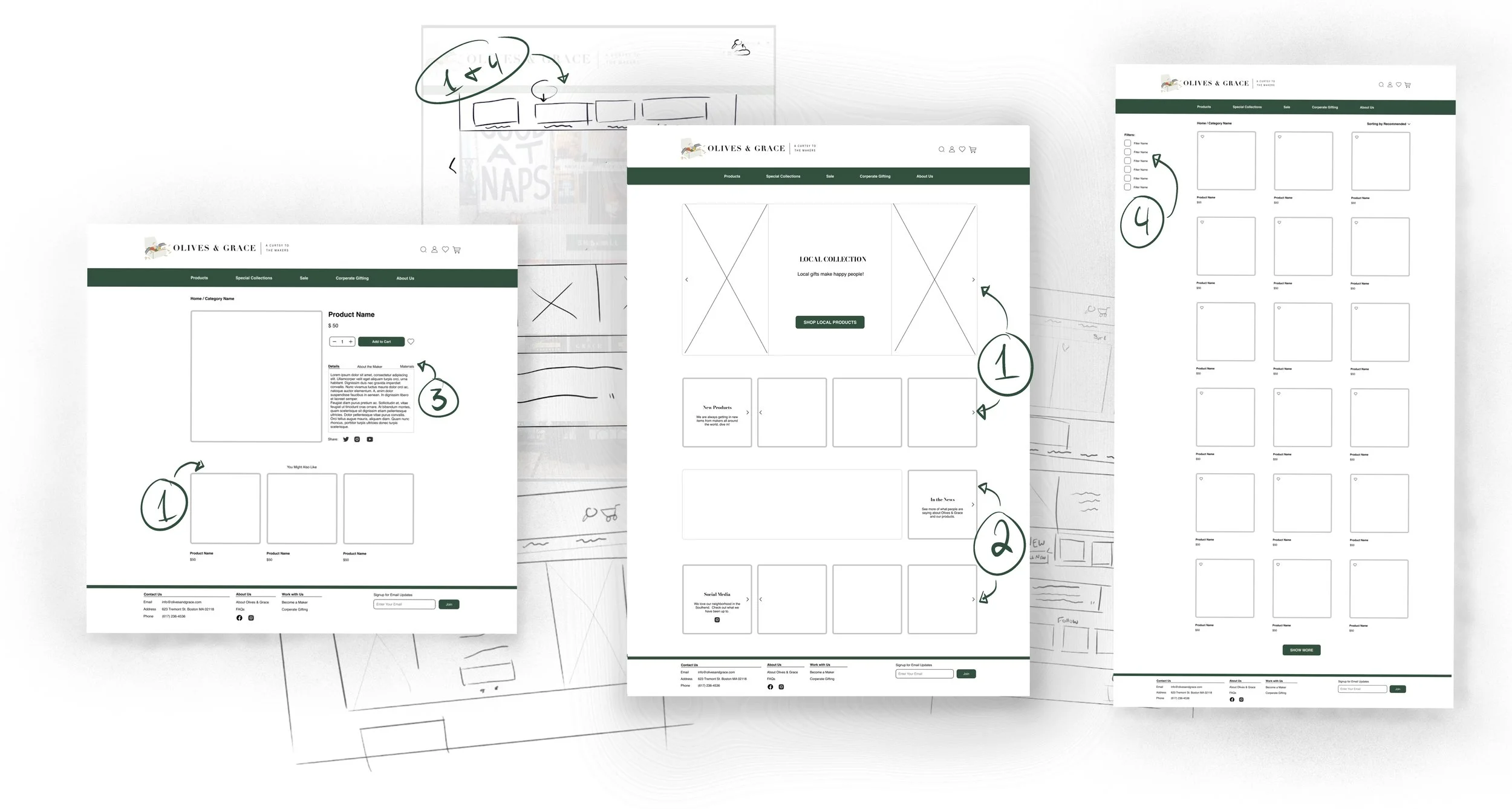
With this new navigation in mind I translated my sketches into Figma executing the navigation and discovery features for Heather, our user.
To spark gift giving imagination I added images to the newly categorized navigation bar, and featured products on the home page.
To foster connection and trust I integrated Olives & Graces instagram feed and press content on the homepage.
To highlight the makers and product quality I created tabs with descriptions Heather can flip through on each product page.
To support ease and findability when shoppers already had a category of product in mind.
To wrap the purchasing process in love, I made the add a gift message feature easy to access during check out.

The Design in Action
Testing
Did I Move the Needle?
To learn if my design changes made navigation easier and would lead to more purchases I ran 4 moderated usability tests asking my participants to pick out 2 candles, add them to their cart, add a gift message, and check out.
What Went Well:
All 3 participants were able to complete the tasks successfully
All participants were able to find their first candle and add it to their cart in under a minute, whereas it took participants around 3 minutes to find a candle on the existing website.
All 3 participants were able to find the gift message function on their first try, where as on the existing website none of the participants were able to find it without assistance.
What Needs Improvement:
1 participant did not see the filter feature right away
Next Steps & Reflection
To move this project forward I would improve the visibility of the filter feature and build out more product categories to further test discoverability on the site. Finally, on future test, I want to make sure I am telling the story of Olives & Grace, and their dedication to elevating small business makers, as connection and ethics were very important to shoppers like Heather.
This project taught me the importance of clearly labeled components and the use of autolayout in Figma. Once I started using those tools I was able to make modifications to multiple pages quickly to help speed up my workflow and make sure elements spoke the same design language frame to frame.


