Christ Community Church Montreat: Website Revamp
The Challenge
Christ Community Church: Montreat is a Gospel forward, Evangelical Presbyterian Church nestled on the campus of Montreat College, in the mountains of NC. They pride themselves in their mission work in their community and supporting mission work around the world.
Their communication coordinator came to our team with two distinct problems. They have the reputation in their town of being the “rich” church that is not part of their community, and they want to better tell the story of who they are and their “vibe” so they are more welcoming to newcomers, especially college age kids. They also have been having a hard time making their website user friendly for their older congregants who are not so tech-savvy.
Project Overview
Role: UX Researcher & Lead Client Contact
Team: Tanaira Morgan & Dan Amaro
Timeline: 2.5 Week Sprint
Tools: Otter.ai, Google Sheets, Google Docs, Google Forms
Methodology: Competitive & Comparative Analysis, Heuristic Evaluation, Survey & User Interviews, Task Analysis, Affinity Mapping
Diving into Research
The Competitive Landscape
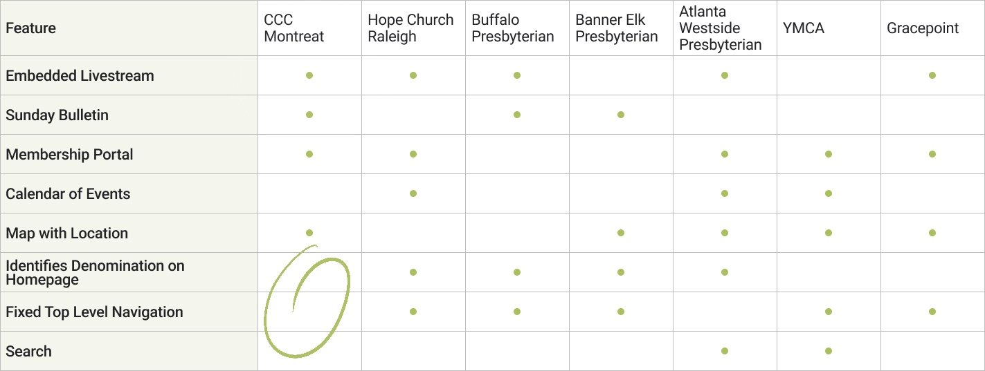
After meeting with our client to understand what her problems were, I wanted to get an understanding of what other community centric businesses were doing on their website to identify what CCCM was doing well, and where they had opportunities for growth. From this I noticed that they were falling short by not clearly identifying their denomination on their homepage. Their navigation bar switching to a hamburger menu on some desktop computers seemed like a potential usability issue, and was not common amongst their competition. And finally, although most of the other churches did not have a search feature, two comparators did, and since Christ Community Church is so active, it could be an easy way for church members and newcomers to find specific church information quickly.
What are the Pain Points?
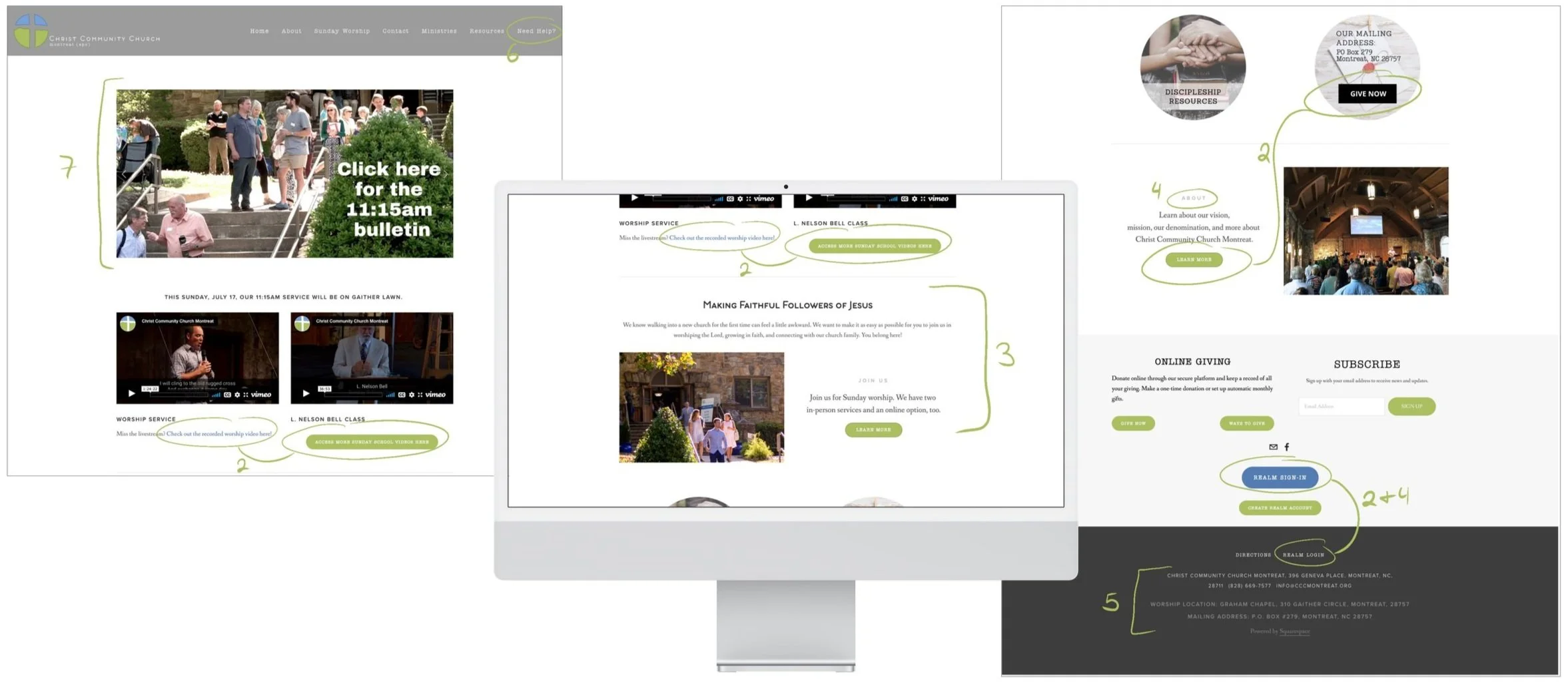
Once I had an idea of what other businesses were doing, I wanted to take a closer look at the Christ Community Church website and do a Heuristic Evaluation to identify usability pain points based on industry standards. To do this the team, as well as some recruited users, navigated through a few tasks on the website to see where we ran into issues. From this exercise I identified _ issues that if resolved, would make navigating the website easier for newcomers and seniors.
Lack of clear organization on homepage
Inconsistent button size and shape, as well as multiple buttons near each other with the same function adds to visual overwhelm and confusion
Inconsistent fonts & font sizes can be distracting
Light font color and text in all caps are hard to see and read
Multiple addresses grouped at the bottom without consistent labeling makes it challenging to know where to go when
Terminology on website, such as “Need Help”, “Sunday School”, and “God Practices”, does not match industry standards or is unclear
Moving slides of important information at the church transition very quickly making them hard to read
Learning About the Congregation
With our client’s help I was able to survey 29 congregants and staff members to learn about Church demographics, how often users go on the website, and what they go onto the website for. From the survey I learned that 79% go on the website to access the livestream and 71% to learn about upcoming events.
-
What Brings People Online?
Out of all of the responses, the top two reasons that people went on the website were to watch the livestream (79%) and to learn about upcoming events (71%).
-
How Did People Find this Church?
The most common reason people started attending (47% of people) CCCM was because they got an invitation from a congregant or staff member. The next most common reason was due to the church’s location on Montreat’s campus (26%). Only 10% of people mentioned using the website during their church shopping process.
-
Demographics
I learned that 68% of respondents (17 people) were over the age of 60, verifying that it would be important to keep accessibility top of mind during the design process.
Chatting and Observing to Understand
The survey results helped inform my interview questions. I developed 2 sets of questions, one for members and another for “newcomers” who have never been on the website before. From both groups I wanted to learn what is important to them in church, and for members I also asked them to share 3 words they would use to describe CCCM. I then gave both groups the tasks of finding the livestream, looking for a volunteer opportunity, and finding a sunday school class. These three topics were selected because they were what was highlighted from our survey and from our client as important topics for the church.
Due to our quick timeline I was only able to recruit 1 member to participate in the interviews. To compensate, I recruited 8 “newcomers” 4 fitting the younger demographic, and 4 fitting the senior demographic to get an understanding of how each group would approach the website.
-

What Newcomers are Looking For
What is important to church shoppers is a sense of belonging, which they find in matching beliefs, getting a personal invitation, and finding a congregation with diverse mindsets and demographics. They also value how close the church is to home, the aesthetics of the building and the website, and if the church gives them ways to be involved in mission work.
“After we talked to some people we can lock in the one we're attending because we like some of the people we met and it was also relatively speaking close to where we live.”
-

Livestream Confusion
Participants navigated to 3 different locations to find the Livestream, even though it was on the homepage. It was clear there was not a clear path to access the livestream. A few participants said they were looking for clear buttons to find the livestream.
Once they accessed the livestream participants wanted to make the video larger, but the majority of senior users had a hard time figuring out how to do so.
The small font and light color of text exasperated senior participants when finding the livestream.
“I will say that the little symbol I don't know that symbol, the full screen symbol. So which is probably why I didn't know how to look for that. And that's again, that's probably me and my lack of knowledge here.”
-

Who Needs a Bulletin?
I learned there was a clear split between whether or not participants look at the bulletin during service. Since there was a split I referred back to the client and past congregation requests, and learned that finding the bulletin was a pain point for congregants and they needed to find it.
“I don't feel like [a bulletin] is necessary. If you're like new. It's nice to know the flow of things. But if you've already been there a lot you kind of know how it's gonna go.”
-

Volunteering Where?
Users were unclear where volunteer opportunities would be, and were looking for the word volunteer as they skimmed the website.
-

Lost in Translation
Users assumed “Need Help” meant get help with the website and “Sunday School” meant class for children.
“[Need help] would mean like, I need help on if I cannot find here what I'm looking for.”
-

Disappearing Navigation Bar
Multiple senior participants did not realized the navigation bar existed and purely clicked on links on each page because they did not realized it existed in the hamburger menu format.
Defining the Problem
Who are we Designing For?
From this research we confirmed that we have two very different demographics we needed to keep in mind as we developed the website design.
Meet Barry, CCCM’s Primary User
Barry’s Problem
Barry needs a clear way to find what’s going on in the church, so that he can stay involved in the community by giving back and helping his fellow members and newcomers feel welcomed.
Meet Nathalie, CCCM’s Secondary User
Nathalie’s Problem
Nathalie needs a way to determine if a church is a diverse and inclusive community that aligns with her beliefs and feels vibrant because she wants a place that feels welcoming, like she belongs.
Ideating and Creating
Sparking Ideas Rooted in the Problems
Once we understood Barry & Nathalie’s problems we started to ask ourselves how might we create a sense of belonging from the start? How might we highlight the beliefs of the church in a beautiful and welcoming way? How might we increase the current member’s engagement in the church so that they will be more encouraged to engage the surrounding community?
Creating Order
From my initial research we learned that the organization of the website was a major confusion factor for members and newcomers alike. I identified that the top level navigation of the website was not clear and users had to click around randomly to find what they were looking for. With this in mind my teammate conducted a card sort to update the navigation with Nathalie and Barry in mind.
“Oftentimes the way I think it's not the way the person who's built this website thinks. And so I have to just guess unless they give me you know, the direct steps to get there. And unless I do it often, then I typically have to relearn the process.”
— Interview & Contextual Inquiry Participant, 70 years old
-
Old Site Map

-
Proposed Site Map

Sketching Concepts for Nathalie & Barry
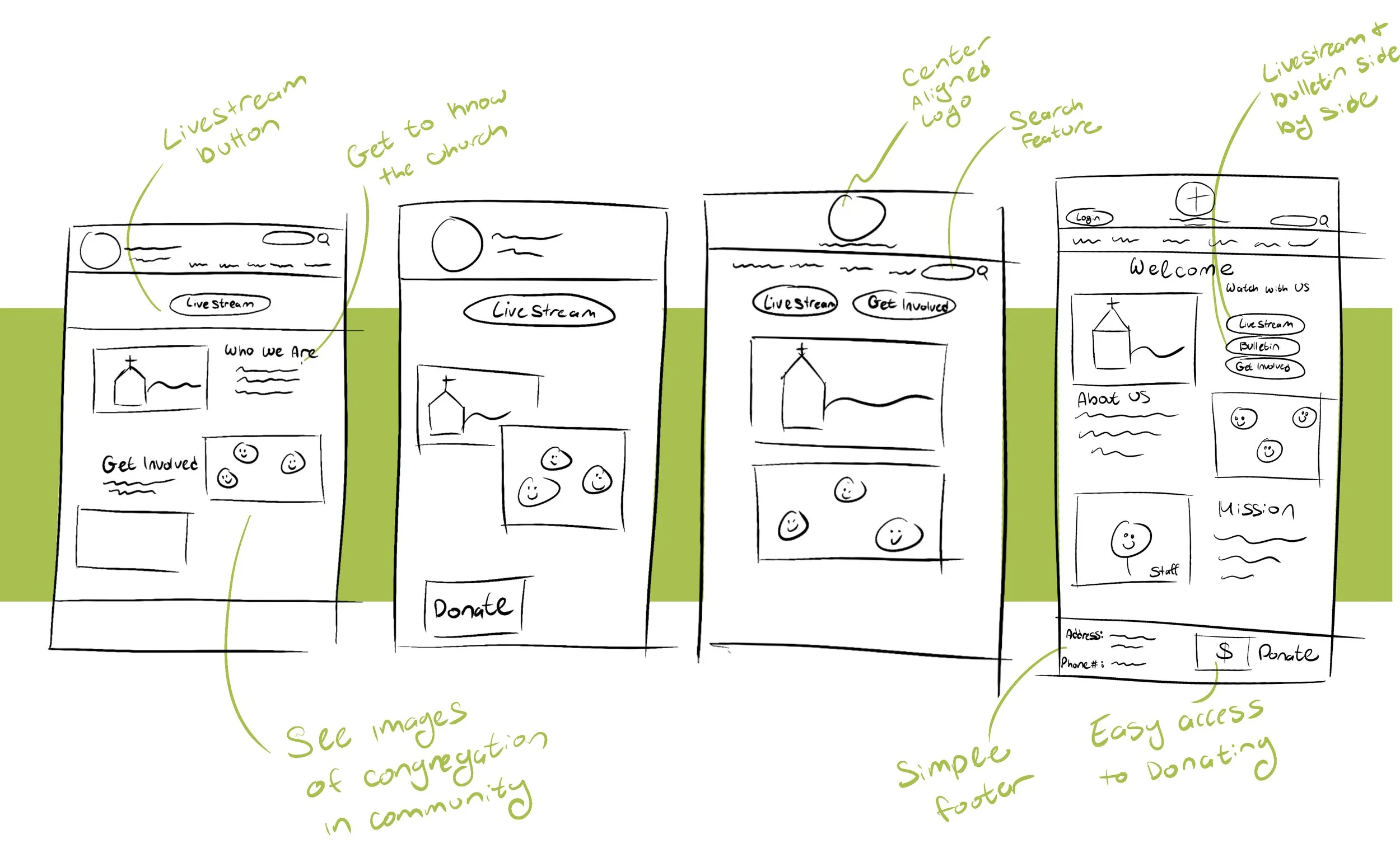
Our team design lead ran a brainstorming session to come up with ideas for the homepage with Nathalie & Barry’s needs in mind. Each team member and our client all sketched together over zoom and then presented and critiqued our ideas so the design lead could run with the strongest concepts while wireframing in Figma.
Prototype Rooted in Insights
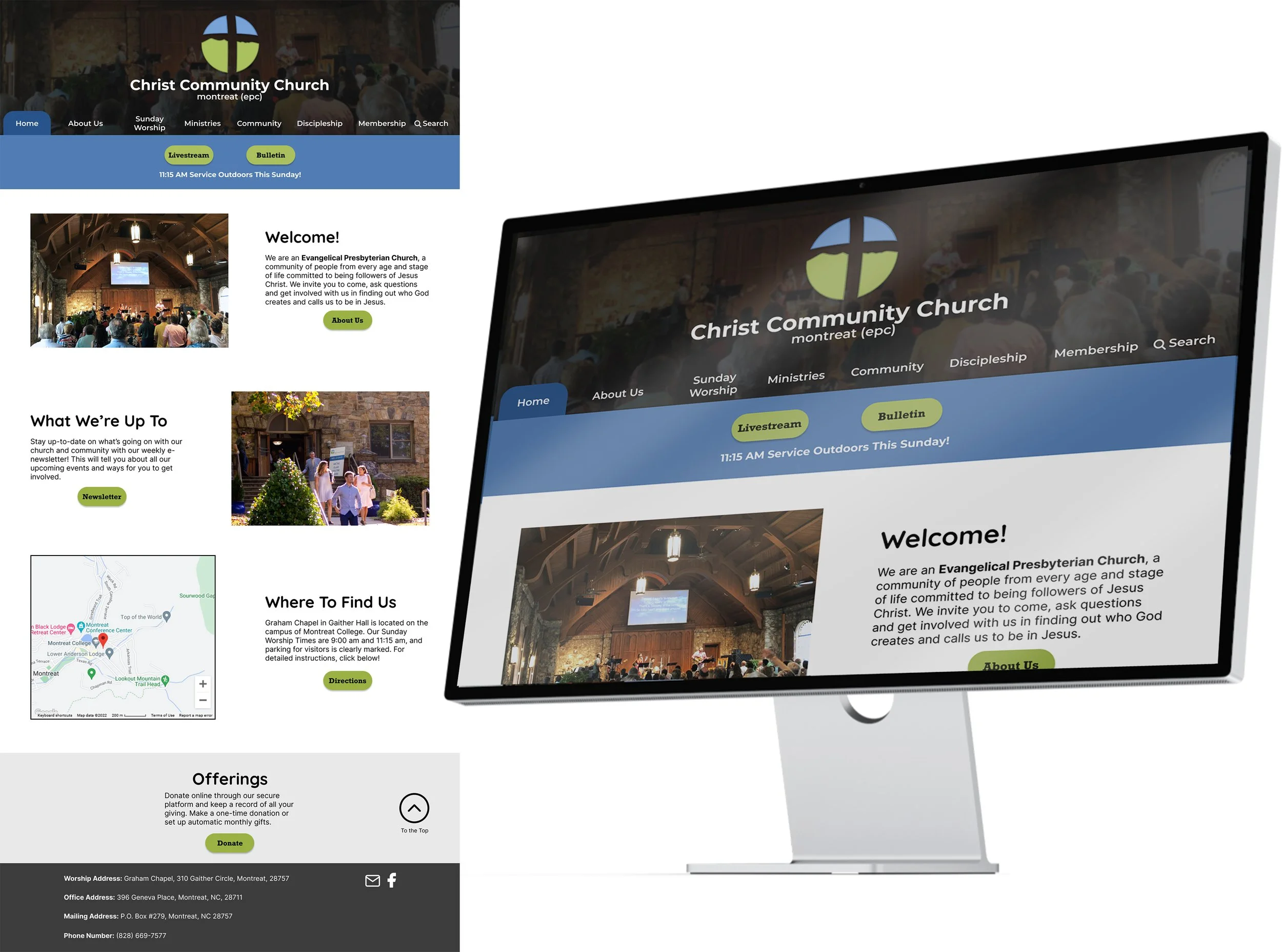
The homepage has been simplified to focus on what users were looking for when going on the website.
A variety of pictures of the church and congregation so newcomers can get a peak at the beautiful old architecture and the demographics of congregants
A sense of who CCCM is by highlighting “About Us” and upcoming events in the newsletter on the homepage
Directions to the church so newcomers can quickly see how far the church is from their home, and to make sure no one gets lost (I learned in interviews that the chapel is hard to find)
Livestream and Bulletin buttons located side by side at the top of the page since the number one reason users were going on the website was to watch the service online
Enlarged text and improved contrast to match ADA standards
Testing
Developing a Plan
Now that the design was built I wanted to test it with both of our user groups to see if the redesign improved the user’s experiences. I gave each group their own set of tasks to complete on the website and asked them:
-

5 "Newcomers"
What are your 1st impressions?
Show me how you would watch the service on Sunday.
Show me how you would learn about upcoming events
What are 3 words you would use to describe CCCM?
Would you visit CCCM based on what you see?
-

5 Members
What are your 1st impressions?
Show me how you would watch the service on Sunday.
Show me how you would learn about upcoming events
Find the membership portal
Did We Move the Needle?
What Went Well:
The church seems “Welcoming”, “Open”, “Simple”, “Casual”, and “Friendly” to users, achieving the church’s goal of seeming welcoming
Over half of the newcomers said they would be interested in visiting the church if they were in the area
All participants were able to find the Livestream in an average time of 10.75 seconds and rated the experience as 5/5 on an easiness scale.
There were 0 issues reading any text on the website.
What Needed Further Refinement:
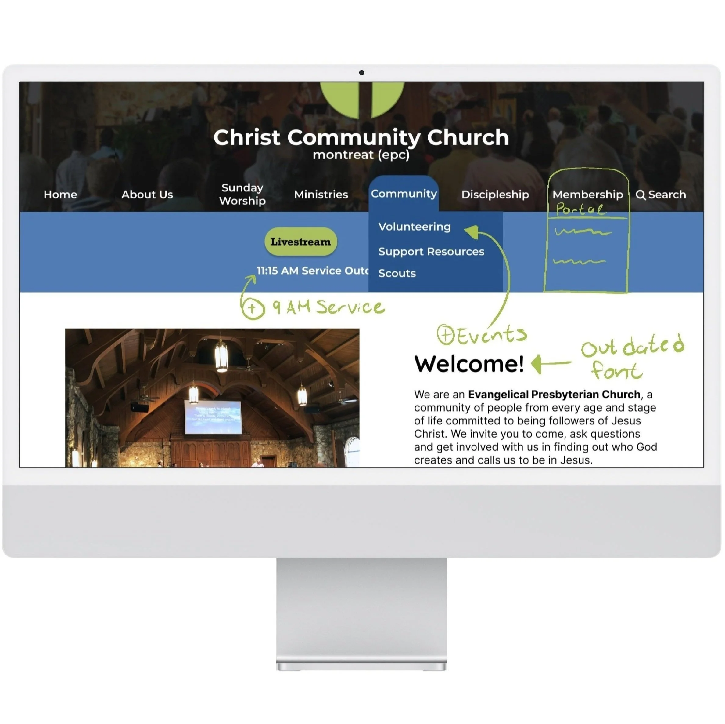
Only 1/2 of the members rated finding the membership portal easy. With some additional probing I learned that adding the word portal and having a drop down under Membership would help add clarity.
Most users struggled to find upcoming events. I saw that over 1/2 of the users looked under the Community tab to find events.
Two of the newcomer demographic called the font very “comic sans” and said it was out of date.
Member’s mentioned they wanted a clear identification that there are 2 services.
The Revised Design in Action
From these learnings, my teammates modified the site map to include upcoming events under community and to include Membership and Realm Sign-In under the newly named Membership Portal. They also added an indicator for the 9 am service in the top banner so members and newcomers alike can easy see both service options.
Next Steps & Reflection
Working with my team on this project for Christ Community Church Montreat was such a fulfilling challenge. After presenting our work to our client, they asked if we could write up a proposal to continue working with them to update the rest of the site and execute it on Wix or Squarespace. What we proposed to do next is run further contextual inquiries and task analysis on pages we have not yet addresses to learn from users what is working and what needs to be improved. We will run a tree test on the site map to ensure all of the recategorization makes sense to members and newcomers. From this research the team will conduct more brainstorming sketch challenges to redesign and re-organize further pages, to further test and refine.
Leading research and testing for this project taught me a lot about conducting research on very specific user groups. I attempted to streamline recruiting by emailing out a Calendly link to congregants who offered to participate, and only received one response out of 13. I now know to buffer in more time for people to sign up and to ideally get a phone number and email address so I can personally reach out a few times while recruiting. I later learned that there was a conference going on the days I scheduled interviews, so in the future I know to ask my client if they know of any events or barriers coming up that would hinder people participating on certain days. During the testing with user’s I had to practice on the fly how to help people unfamiliar with zoom how to screen share. Two participants in the end were not able to share their screen after 15 minutes of trouble shooting. I would in the future plan in more buffer time for troubleshooting and send in advance clear step-by-step instructions on how to do hard tasks so they can see visuals on their end to make it easier. I also learned that although Otter.ai made recording notes easier while running interview, it is not a perfect system and time still needs to be built in to translate certain sections since the technology cannot perfectly transcribe what my participants and I are saying.


